Support & Resistance:
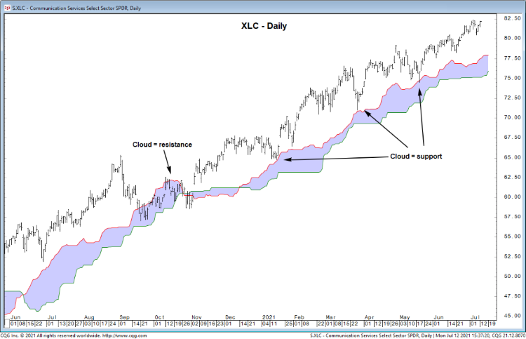
Ichimoku Cloud Model:
The Cloud Model is a forward looking trend-following system (on Bloomberg function is GOC) that is widely followed in Japan.
The Conversion (turning) Line, or the short term price momentum, is then found by determining the (Highest high + Lowest low)/2) of the last 9 periods.
The Base (standard) Line is found by calculating the (Highest high + Lowest low)/2) over the last 26 periods. If the price is above the base line or if the line is increasing in slope, then there is an upward bias.
Afterwards, the Lagging Span (delayed line) is found by plotting the current close 26 periods ago. Many use the lagging span to check for any potential trend reversals. The price generally moves higher when the price of that security is below the lagging span. If the lagging span is about the move upward above the prior price line, then the market is bullish. It is considered weaker if the line just crossed the prior price line as this could indicate a sideways market.
Finally, one would look at the Kumo Cloud which is made of Leading Span A and Leading Span B. The Kumo Cloud is used to predict support and resistance levels. Leading Span A (1st preceding span) is found by calculating the following formula: (Base line + Conversion line)/2). Leading span B (2nd preceding span) is found using (Highest high + Lowest low)/2). Both are plotted 26 periods ahead.
Weak Sell Signal: In this case, the conversion line and the base line make a downside cross. The current prices are above the cloud.
Strong Sell Signal: Here, the conversion line and the base line make a downside cross as well, however, the cloud is below the current price.
Weak/Strong buy signals occur in a similar fashion. Examples of each are below.
We only employ the two lines that make up the body of the cloud, which are Leading Span A (1st preceding span) and Leading Span B (2nd preceding span).
Fibonacci Levels:
The Fibonacci Levels are derived from the Fibonacci Sequence. Each successive number in the sequence is the sum of the two previous: 0,1,1,2,3,5,8,13,21, etc. Any given number is approximately 1.618 times the preceding number (the Golden Ratio).
Fibonacci Retracement Levels connect two points. These two are typically a low and a high point, and are used to indicate where support and resistance will most likely occur. The Fibonacci retracement levels are 23.6%, 38.2%, 61.8%, and 78.6%. Each percentage is used to indicate the areas where the price could stall or reverse. (50% is also used, though that is not a Fibonacci ratio.)
We tend to use “measured moves” (a 100% extension) for deriving a price target and potential resistance.

Moving Averages:
A moving average represents the summation of a specific security’s price action over the last ‘n’ time periods divided by ‘n’. ‘n’ represents the time span (can be days, months, or years).
In general:
A 50- day moving average gives a sense of the intermediate- term trend and holds importance as support and resistance. This is helpful for placement of stop loss points.
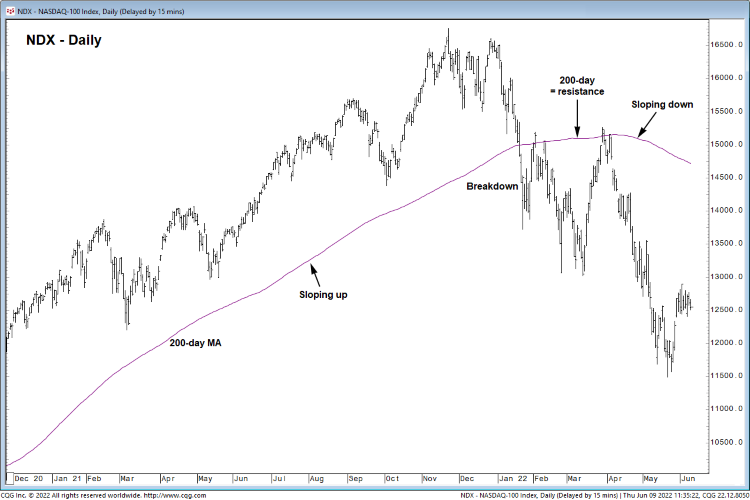
A 200-day moving average gives a sense of the long-term trend and holds importance as support and resistance as well. At many times, this is self – fulfilling because it is so widely followed. An example is graphed below.
Importantly, a 12-month moving average gives a sense of the long term directional bias.
We view moving averages as cushions, rather than precise support/resistance levels.
Moving averages show when investors are bullish/bearish on a security.
For example, if the security’s price is above its moving average, then the expectations for that security are increasingly bullish. Therefore, the investors’ expectations are much higher than the average expectations of the securities’ price.
Peaks & Troughs:
Peaks represent the former resistance and where sellers were once present. Graphically, peaks occur between two lower points. Each peak can act as resistance or support after a breakout.
Troughs represent the former support and where buyers were once present. Graphically, troughs occur between two higher points. Each trough can act as support or resistance following a breakdown.

Trendlines:
Trendlines often provide support or resistance, especially when a trendline is well-tested.
Uptrends are drawn connecting important higher lows.
Downtrends are drawn connecting important lower highs.
Channels are derived from uptrend and downtrend lines.
Overbought/oversold measures can help gauge important lows/high for each security.
Overall, trendlines may help distinguish between emotional decisions and analytical ones.

Price Patterns:
Price patterns are recognizable price movements. These are often defined by trendlines and other support or resistance.
Some examples:
Double tops/bottoms: Take the shape of an “M” or “W”.
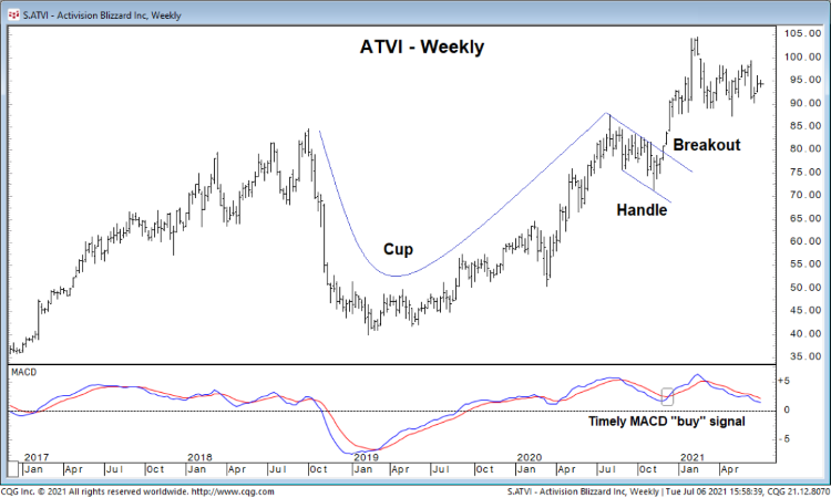
Cup & handle formations: A rounded base followed by a shallow pullback and breakout above resistance, based on previous peaks.
Head & shoulders: A bearish reversal pattern defined by previous peaks and troughs. An inverse head an shoulders is a bullish reversal pattern.
Triangles: Typically continuation patters defined by support and resistance, via at least one trendline